Using the K-Fold Cross-Validation Statistics to Understand the Predictive Power of your Data in SVS
In cross-validation, a set of data is divided into two parts, the “training set” and the “validation set”. A model for predicting a phenotype from genotypic data and (usually) some fixed effect parameters is “trained” using the training set—that is, the best value(s) of the parameters is (are) found using the training set data, including its (known) phenotypes. This “trained” model is then used to try to predict the phenotype values of the validation set. The predictions are then compared to the validation set’s actual phenotype values.
K-Fold Cross-Validation simply repeats this “K” times (a “K-Fold” process) over a dataset that has previously been subdivided into “K” sections. “K” is typically 5 or 10, resulting in, for example, “5-Fold Cross-Validation” or “10-Fold Cross-Validation”. For each repetition or “fold”, a different subdivided section becomes the “validation set”, and the remaining data becomes the “training set”. The sets of comparisons of values are averaged over all repetitions of this process.
Running K-Fold Cross-Validation
To run K-Fold Cross-Validation from a genotypic (or a numerically recoded genotypic) spreadsheet, use Genotype -> K-Fold Cross Validation (for Genomic Prediction). If your spreadsheet is in genotypic format, a numerically recoded version of your spreadsheet will first be generated. Then (for either format) the following dialog will appear:
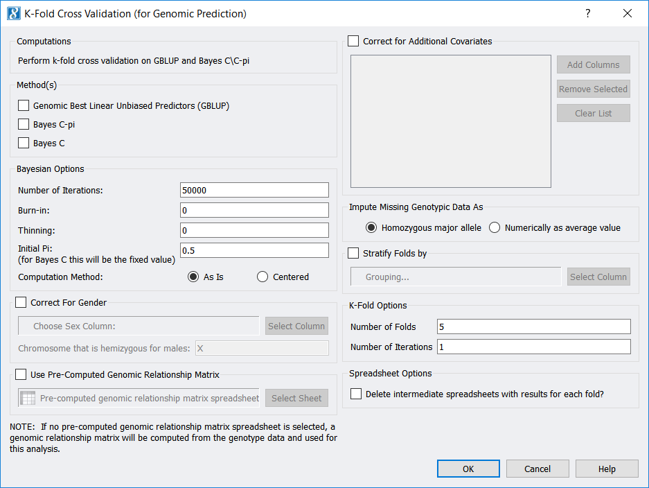
Among other parameters, you may choose to use the Genomic Best Linear Unbiased Predictors (GBLUP) method, the Bayes C-Pi method, and/or the Bayes C method. Also, note you may select the “Number of Folds” (which is “K”), as well as the “Number of Iterations”, which is how many times you would like to repeat the whole K-Fold procedure.
Outputs include prediction, fixed-effect parameter values, and allele substitution effect (ASE) values for each “Fold” (unless you checked Delete intermediate spreadsheets…), as well as one spreadsheet with predictions for all samples along with spreadsheets containing averages of the fixed-effect parameters and of the ASE values.
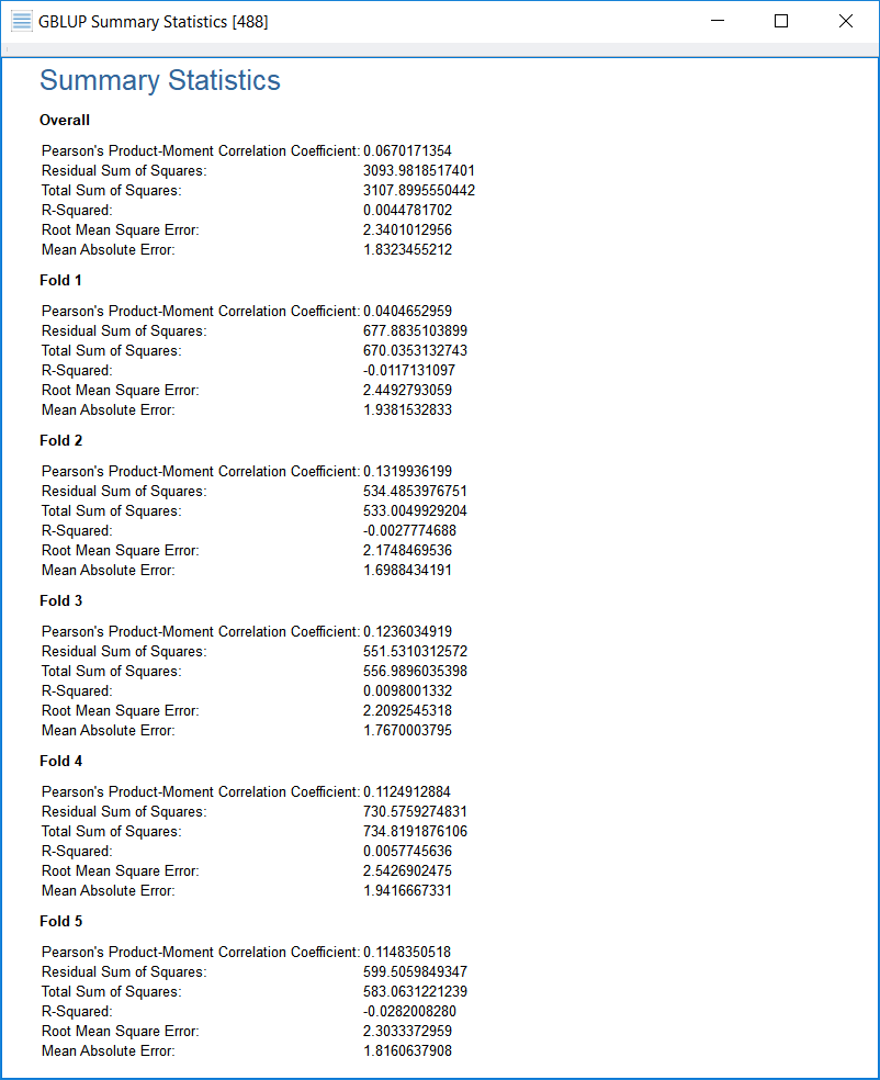
As a final output, a viewer will appear with statistics resulting from comparisons between the predicted phenotype values and the actual phenotype values, both for each individual validation set (“Fold __”) and for all data (“Overall”).
If the phenotype is quantitative, statistics related to quantitative phenotypes are shown, while if the phenotype is binary (case/control), statistics related to binary phenotypes will be shown. The following screenshot shows the output for a quantitative phenotype:
Understanding the Output Statistics
We recently have been asked by a customer to clarify which quantitative output statistic from K-Fold Cross-Validation analysis is “more important” or “more useful”, the Pearson Correlation Coefficient or “R Squared”.
Each of the six quantitative statistics from K-Fold Validation has its own usefulness and may be a personal preference for some analysts. These statistics may be summarized as follows:
- Pearson’s Product-Moment Correlation Coefficient (r_{y, y-hat}) This is the correlation between the prediction values and the true values. The more tightly these are correlated (meaning the closer this is to +1), the better, according to this statistic, is the fit. But see my remark below about the Pearson’s Correlation Coefficient.
- Residual Sum of Squares (RSS) This is the sum of the squares of the residuals, or differences, between the prediction values and the true values. The smaller the RSS, the better the fit.
- Total Sum of Squares (TSS) This value, which is simply output for comparison purposes, is the sum of the squared differences between the true values and their overall mean. If the RSS is small by comparison to the TSS, the fit is better than if the RSS is about the same value as (or even larger than) the TSS.
- Coefficient of Determination (“R Squared”) This value is defined to be equal to the expression (1 – (RSS/TSS)). Values of the Coefficient of Determination may range up to 1 for a perfect fit and close to, but less than, 1 for a good fit—on the other hand, when the fit is not as good or not good at all, the Coefficient of Determination can be far less than 1 or be zero, or even be negative.
You may ask, “How can something called ‘R Squared’ go negative?” The answer is that if we were executing linear regression, R Squared (the Coefficient of Determination) would live up to its name as being the square of the Correlation Coefficient r between the true values and predictions (and never go negative). However, K-Fold does not use linear regression, but instead uses one or more of the three mixed-model algorithms. Therefore, negative Coefficients of Determination (“R Squared” values) may, and sometimes do, result. (As a side note, for linear regression, the RSS is never larger than the TSS—but again, linear regression is not being used here.) To continue:
- Root Mean Square Error (RMSE) This is the square root of the mean of the squares of residuals, or differences between the prediction values and the true values (square root of (RSS/n)). The dividing of the RSS by n (the number of samples) in the RMSE calculation makes the RMSE a measure of the typical amount of error any prediction may have.
- Mean Absolute Error (MAE) This is the mean of the absolute values of the residuals (or “errors”). One advantage of MAE is that it is not thrown off by statistical outliers, or residuals that are far larger in magnitude than most of the residuals from the same test. Another advantage is that the concept of MAE may be a little easier to grasp than that of, say, RMSE.
As stated above, if the Pearson’s Correlation Coefficient between the predictions and the true values is close to +1, the fit may be very good—however, if the relation between the predictions and the true values is best described by y-hat = m y + b, where m is not 1 or b is not zero, then the fit is not as good, even if the correlation is very close to +1. (This is another phenomenon that would not occur if we were using linear regression.) Meanwhile, the RSS statistic does not suffer from this problem. An RSS at or near zero means the fit is exact or quite close. If the relation between the predictions and the true values were best described by y-hat = m y + b, where m not 1 or b not zero, the RSS value would not be close to zero at all, and the Coefficient of Determination would not be close to one, even if the Pearson’s Correlation Coefficient were close to one.
In any case, RSS, TSS, the Coefficient of Determination, and RMSE are variance-like quantities (or standard-deviation-like quantities for RMSE), where a low variance of the residuals implies a better fit. MAE penalizes smaller errors in prediction, relative to the other measures, but, as stated above, MAE is not so sensitive to outlier data.
Finally, the Pearson’s Correlation Coefficient and Coefficient of Determination are relative measures which do not depend on the scale of the phenotype, nor on the number of samples. RMSE and MAE do depend upon the scale of the phenotype, but they do not depend on the number of samples. The RSS (and TSS) depend upon both the scale of the phenotype and the number of samples.
In summary, the Coefficient of Determination (“R Squared”) has, to me, the most going for it. But these statistics all working together paint the best picture of the measure of success of these predictions.
What is the Statistical Output If I Have a Binary Phenotype?
We were not asked specifically about the outputs for a binary (case/control) phenotype, but we might as well explain these here, also. These measures are all different ways of relating the quantitative predictions of GBLUP and the Bayes’ methods to the two possible values of the binary phenotype. These measures are:
- Area Under the Curve (Using the Wilcoxon Mann Whitney method) This method rates whether the greater bulk of the predictions of higher value are (or are not) for cases where the actual value is 1. This method first numbers the predictions by their ranking (highest to lowest), then, for those predictions corresponding to the actual value of 1 (or “True” or “case”), takes the sum of their ranks and subtracts from that n1(n1 + 1) /2, where n1 is the number of these cases where the actual value is one. This result is scaled (divided by) n1 times n2, where n2 is the number of cases where the actual value is zero. A (scaled) value closer to 1 indicates more predictive power, a value close to .5 means “not much predictive power at all”, and a value close to 0 indicates it’s a good predictor in a sense, but it predicts in the “wrong direction” (predicting “0/False/control” when it should predict “1/True/case”, and vice versa).
The name “Area Under the Curve” comes from the fact that this statistic, before scaling, is equivalent to integrating the “receiver operating characteristic” (ROC) curve, which is the true positive rate (sensitivity) plotted as a function of the false positive rate (1 – specificity) (see below for definitions), as you change the value at or above which you call the GBLUP or Bayes’ prediction a “1” prediction rather than a “0” prediction. (If you are curious how this works out, see https://blog.revolutionanalytics.com/2017/03/auc-meets-u-stat.html.)
The ROC curve is used to determine the diagnostic capability of many binary classifier applications. (See https://en.wikipedia.org/wiki/Receiver_operating_characteristic.)
The next four quality measures, Matthews Correlation Coefficient, Accuracy, Sensitivity, and Specificity consider GBLUP and Bayes’ predictions of 0.5 or higher as (binary) predictions of “1” (“positive”) and predictions of less than 0.5 as predictions of “0” (“negative”).
- This is a measure of correlation between the binary prediction and the (binary) true value. Like the Pearson Correlation Coefficient, a Matthews Correlation Coefficient close to 1 shows good predictions, a coefficient near 0 shows the results are not predictive, and coefficients closer to -1 show “good prediction” but in the “wrong direction” (anti-correlation).
- Accuracy This measure is the ratio of valid predictions to all predictions. Close to 1 is good, and close to zero is poor.
- Sensitivity (or true positive rate) This is the ratio of “true positives” (predictions of “positive” that were accurate) to all actual positive values. This ranges from 0 to 1, with 1 being best and 0 being worst.
- Specificity (or true negative rate) This is the ratio of “true negatives” (predictions of “negative” that were accurate) to all actual negative values. This also ranges from 0 to 1, with 1 being best and 0 being worst.
Of the preceding four, the Matthews Correlation Coefficient is preferred by many statisticians because it is a single number that will work well even if the numbers of positive (1) vs. negative (0) actual values are highly imbalanced, and because it will only show values close to 1 if the prediction is working well for both positive (1) and negative (0) predicted and actual values.
- Root Mean Square Error This is calculated the same as the RMSE for continuous phenotypes—that is, the square root is taken of the mean of the squares of differences between the (original GBLUP and/or Bayes’ method) prediction values and the true (binary) values (of either 0 or 1).
Since GBLUP and the Bayes’ methods are really designed for quantitative phenotypes, one could argue that RMSE is really the best measure for how well these quantitative predictions match up with the binary phenotypes for these methods займ по паспорту с моментальным решением.
However, as I said above about quantitative phenotype measures, these statistics all working together paint the best picture of the measure of success of prediction for binary phenotypes.