Eliminate Low-Quality Samples and Markers
In Part I of this GWAS Analysis series, Dr. Eli Sward provided us with a great overview on the value SVS provides in managing the quality of your SNP or NGS data to maintain the high power and accuracy of your GWAS. He also gave a snapshot of what a typical genotype spreadsheet may look like.
Today, I’m going to discuss some basic filtering steps to eliminate
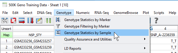
Fig 1. Accessing the sample and marker quality statistics from the Genotype menu.
Focusing on the sample quality statistics, call rate is one default output among many other stats the user can select (Figure 2). Any of these selected statistics will be generated in a new spreadsheet which the user can assess and use to filter out low-quality samples. One simple approach to navigate through the call rate of all samples is to right click on the column header and generate a histogram (Figure 3 & 4).
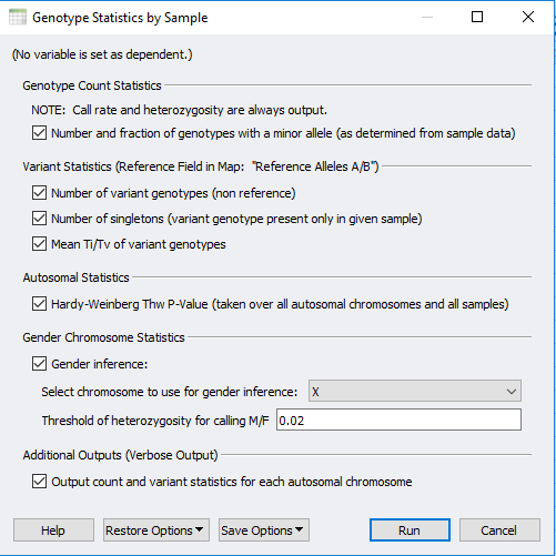
Figure 2. Selectable output for the sample statistics with call rate and heterozygosity always default.
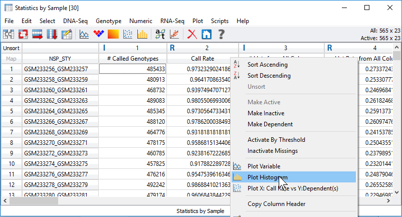
Fig 3. Processing statistical output visually with plots by right-clicking on the column headers.
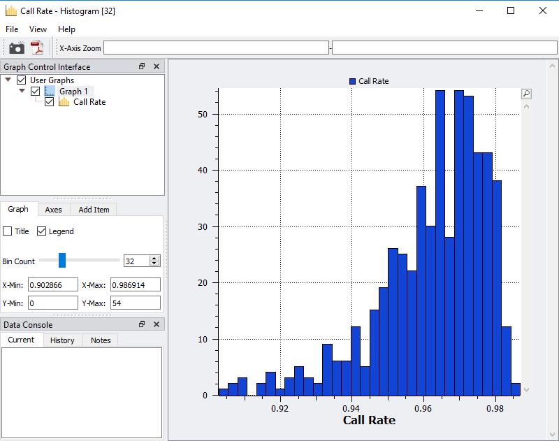
Fig 4. Histogram of sample call rate to easily access an ideal value cutoff of low-quality samples.
After viewing the histogram, the user can get a feel for how many samples have ideal call rate quality and develop a threshold for filtering out low call rate samples. This threshold can be set by going back to the sample statistics spreadsheet, right clicking on the call rate column, and selecting Activate By Threshold (Figure 5). After applying the threshold, and samples with low call rate are then inactivated from the spreadsheet (Figure 6.) The number of remaining active samples can be viewed in the top right corner of the spreadsheet where in Figure 6 you’ll see 468 samples remaining.
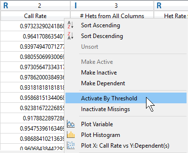
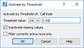
Fig 5. Setting a value threshold allows users a quick way to manage their samples and markers.
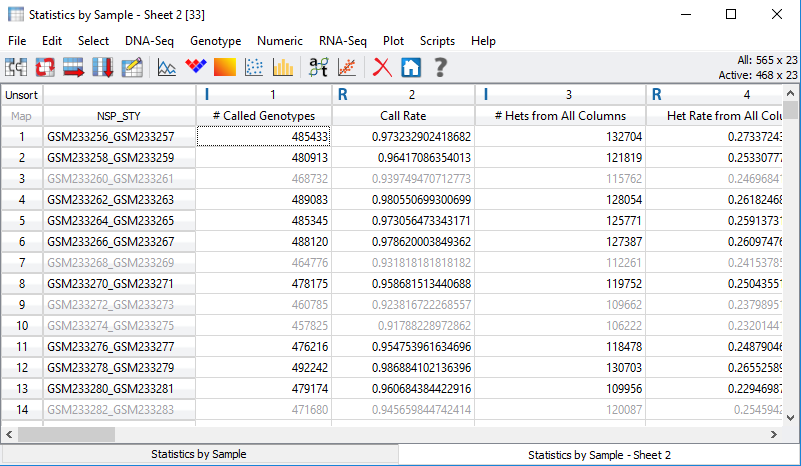
Fig 6. Inactivated samples with call rate values lower than the assigned
threshold.
Now the user can apply this filtered sample set to the original genotypes spreadsheet. From the sample statistics spreadsheet, click Select -> Apply Current Selection to Second Spreadsheet (Figure 7). This will take the remaining activate samples with ideal call rate and apply the filtered sample criteria to the samples in the genotypes spreadsheet (Figure 8).
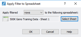
Fig 7. Applying the filtered set of samples to the original genotypes spreadsheet by applying filtered rows (sample IDs).
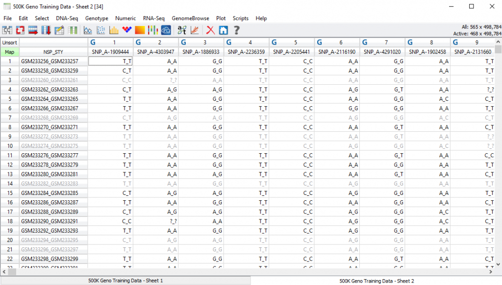
Fig 8. Inactivated/filtered sample genotypes based on call rate criteria.
Shown in Figure 9 the user then can choose to subset their data to only activate columns or rows (rows in the case of samples for this example).
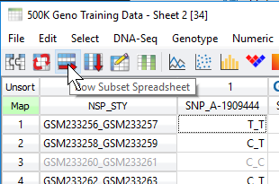
Fig 9. Row subset icon will generate a new spreadsheet of only active data.
This process is an easy way to generate sample and marker statistics, assess the results across your population quickly with plots, and rapidly filter out low-quality markers and samples. This really is the beginning of quality control steps behind a GWAS analysis. The next part of this blog series covers steps to prune markers for linkage disequilibrium as well as investigate sample relatedness so to further improve the power behind your GWAS. If you have any specific questions, please reach us at support@goldenhelix.com!