In this blog update, I’ll be walking you through some of the advanced plotting capabilities with GenomeBrowse. The strategy with any next-gen sequencing analysis is to filter down to interesting variants for either research or clinical conclusion. Golden Helix produces powerful software specifically tailored for this efficient and comprehensive search for interesting and clinically relevant variants. One additional advantage of our software is the ability to visualize the results. Visualizing the genomic data answers multiple questions; for example, is the variant good quality when reviewing coverage in the BAM file? Do any known pathogenic variants match ours? Are these interesting variants shared among affected individuals? The purpose of this blog will be to demonstrate advanced plotting features in our genomic plotting tool, GenomeBrowse.
GenomeBrowse is a stand-alone product but also embedded in our primary tertiary platform VarSeq. In VarSeq (Figure 1), users will use a filter chain (bottom left corner) to isolate a clinically relevant variant (variant table next to filter) then visualize their data in GenomeBrowse (top). The plot in Figure 1 contains the filtered heterozygous exonic deletion overlapping the RefSeq gene annotation for SMAD4 and phenotypic information from OMIM. Above the CNV plots are the zscore and ratio metrics reinforcing the event call. We will start things off by exploring the two metrics to illustrate how to modify plot features in more detail.
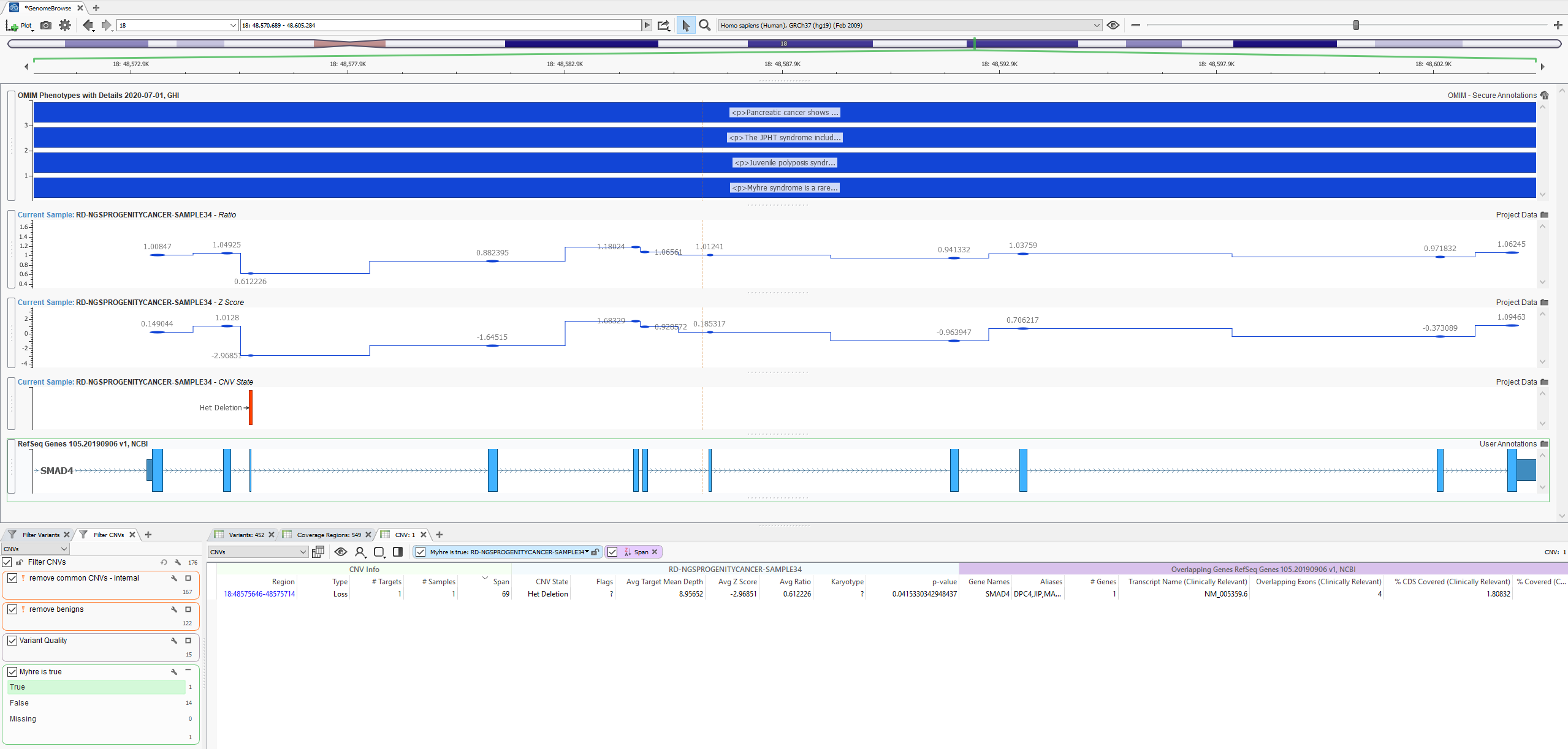
Figure 1: Basic layout of VarSeq software with GenomeBrowse showing a filtered heterozygous deletion in SMAD4
The per-region zscore and ratio metrics can be found in the coverage stats table after running the CNV caller. Right-clicking on the column header gives the user the option to query fields, set as filterable fields, and plot the data. Keep in mind that all columns in the table are not only filterable but also plottable.

Figure 2: Right-click on any column in the Variant, Coverage Stats, and CNV table to access plotting options
After plotting the field, users can access the Control panel to modify their plot format in more detail. An example in Figure 3 is to add the mid-step connector line to the ratio and zscore plots by clicking on the cogwheel icon in the top left corner of the plot. Even more options for layout are obvious when exploring the plotting of various annotations. We will look at ClinVar CNVs as an example to visualize known pathogenic CNVs easily.
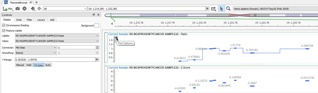
Figure 3: Accessing Controls in GenomeBrowse for more custom layout options with plotting
To add annotations to the plot, click the Plot icon in the top left corner of GenomeBrowse (Figure 4a). Users can then select the desired tracks much like ClinVar CNVs in Figure 4b. The concept here is that we can take the filtered CNV in this sample and see if known pathogenic CNVs overlap. Fortunately, this visual review can be simplified as shown in Figure 4c. Clicking on the Style tab in the control console, I modified the colored presentations for each classification category (i.e. grey for uncertain, blue for benign, and red for pathogenic). This makes it obvious that there are numerous pathogenic CNVs overlapping this region in STK11. This includes a pathogenic deletion matching the two-exon het deletion in this sample. The details of the ClinVar record are also presented in the console on the right side of the screen. This is a straightforward example of a simple overlapping event, but in many cases, the variant in the sample may not be in the catalog. How can a user browse the nearby records to review other variants in the same exon or gene?
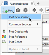
Figure 4a: Clicking the Plot icon in the top left corner of GenomeBrowse accessing the data source window for plotting annotations
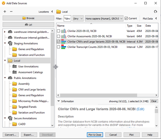
Figure 4b: Selecting ClinVar CNVs for reviewing overlapping pathogenic CNVs in GenomeBrowse

Figure 4c: Final plot of ClinVar CNVs with custom colored classifications, overlapping events, and ClinVar variant details in console on the right side of the screen
One general limitation of any tertiary process is working with the variants available in the given sample being evaluated at the time. Unfortunately, some variants may be missing from various annotation sources such as frequency catalogs or clinical databases like ClinVar for example. It then becomes crucial to be able to review nearby variants and get an idea of how sensitive the gene may be to other similar variants. One strategy for this is in GenomeBrowse as well, where users can utilize the Features List window to review variants within a defined region (Figures 5 & 6). In Figure 5, the sample presented has a variant in the AGPAT2 gene that does not overlap with a known variant from ClinVar. However, clicking on the Feature List icon in the top left corner, users can access the records of all other ClinVar variants in the region (Figure 6). This data can be sorted to quickly review the known pathogenic variants with high review status for robustness in their classification.
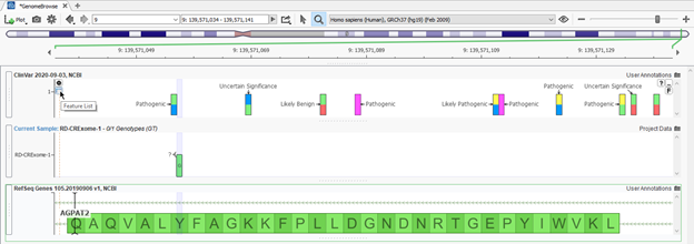
Figure 5: Variant in the specific sample in AGPAT2 gene annotated against ClinVar database with no overlapping variant record and option to explore Feature List

Feature 6: Features list presenting all records of ClinVar variants in the exonic region of AGPAT2 with known classifications and review status
The general purpose of this blog is to give users a bit more exposure to some custom visualization and data exploration plotting capabilities in GenomeBrowse. Though this is meant to be a simple overview, our FAS team is always available to schedule a training call if you’d like some more hands-on training to get your GenomeBrowse view setup for your standards. Please reach out to support@goldenhelix.com if you would like a one-on-one training session. Thank you for reading this blog post, I hope you enjoyed learning more about the plotting capabilities in GenomeBrowse.